01
Lead with the whole range
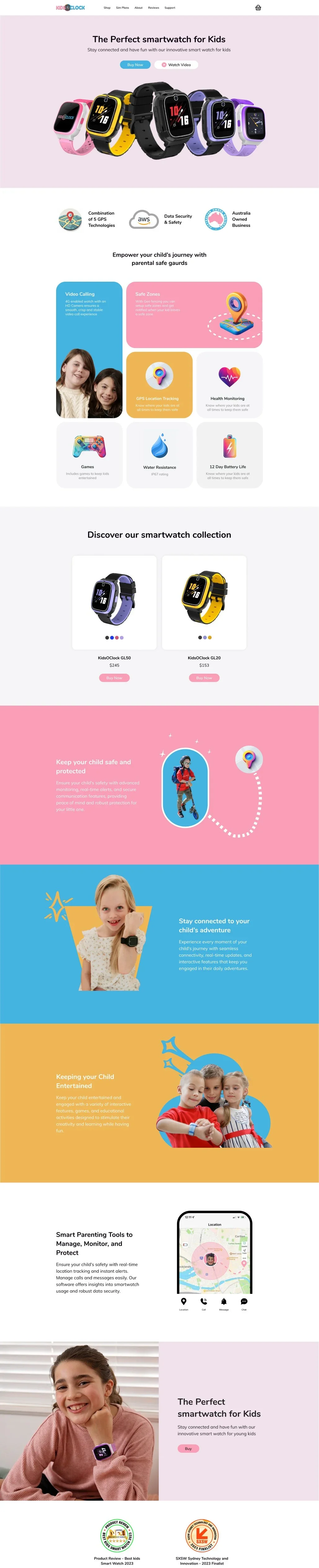
The homepage opens on every watch and colour in one line-up, then moves through safety, connection and play, each in its own brand colour, before the collection and the parent app.
Case Study · Consumer electronics · E-commerce
We redesigned the online store for KidsOClock, an Australian kids' smartwatch brand: homepage, shop, product pages, brand comparison and SIM plans, on desktop and mobile.
Desktop page templates
Mobile layouts, menu included
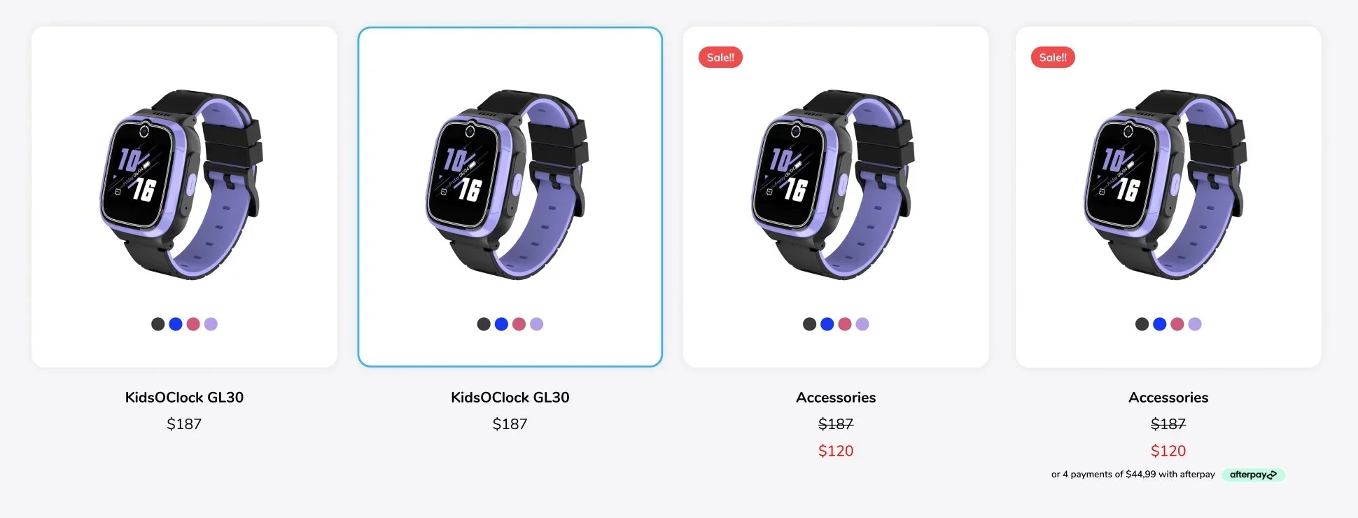
Product card states, from standard to sale with instalments
Product Review's Best Kids Smart Watch, 2023 to 2026
The brief
KidsOClock sells 4G smartwatches with video calling, GPS tracking and safe zones to parents across Australia and New Zealand. Buying one also means choosing a model, a SIM plan and accessories, and comparing it against better-known brands. The site needed to answer all of that without losing the playful feel of a product made for kids.
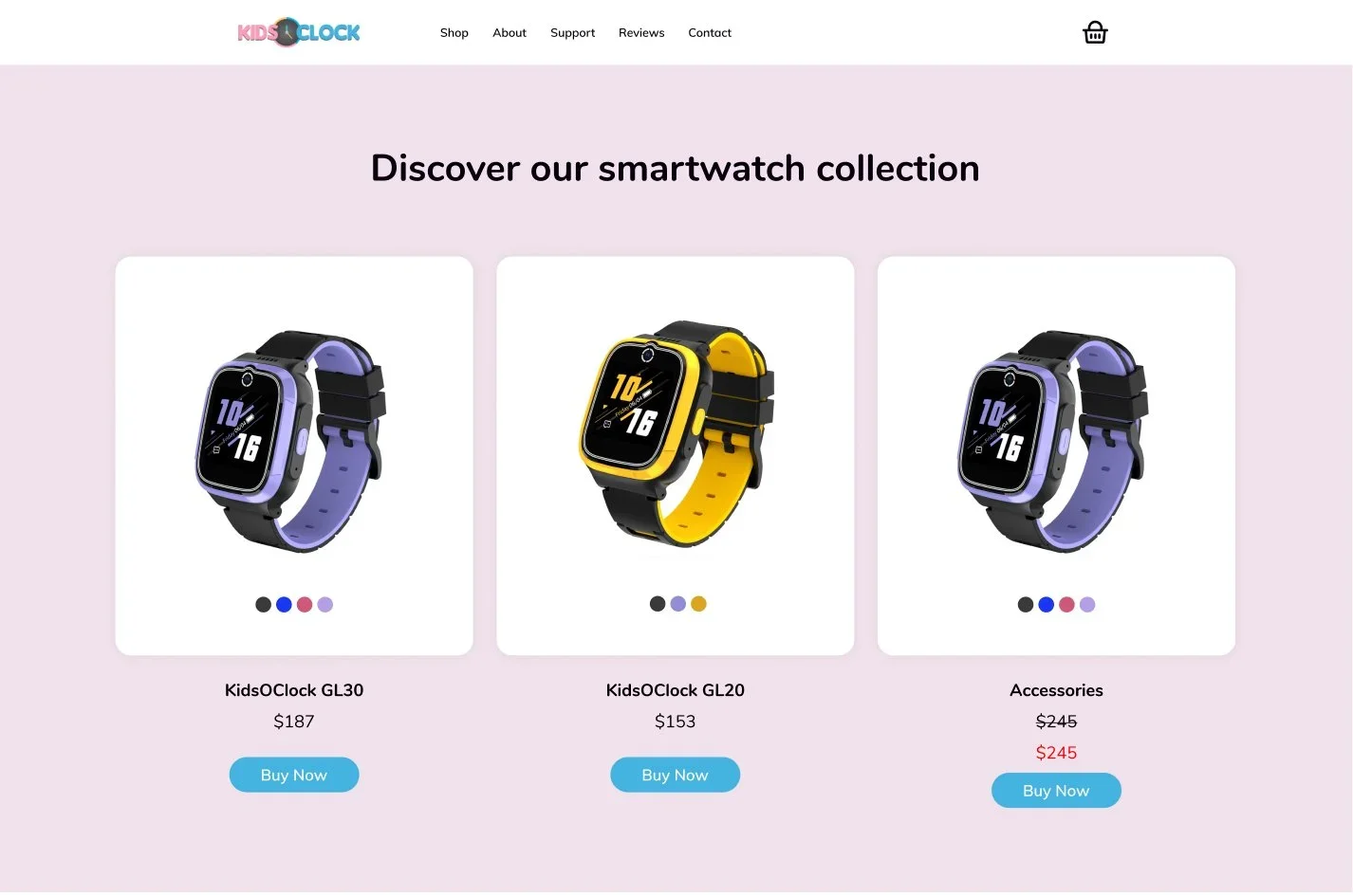
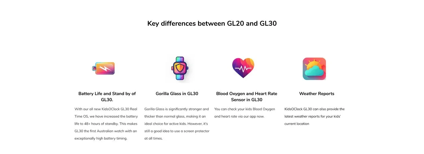
watch models to explain side by side, without making the cheaper one look like a compromise.
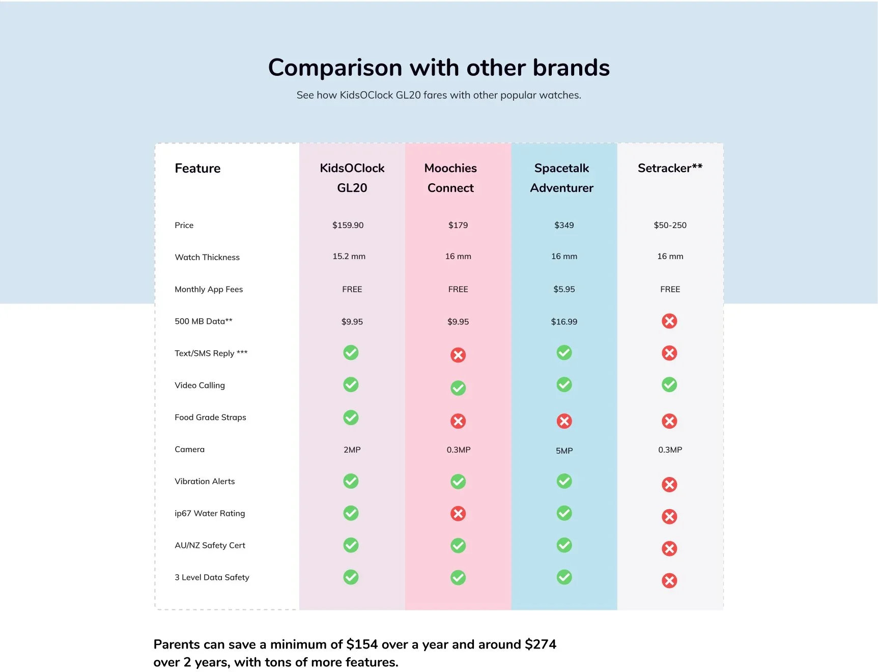
named competitors in a comparison table, feature by feature and price by price.
purchase path that covers the watch, a SIM plan and accessories.
Key decisions
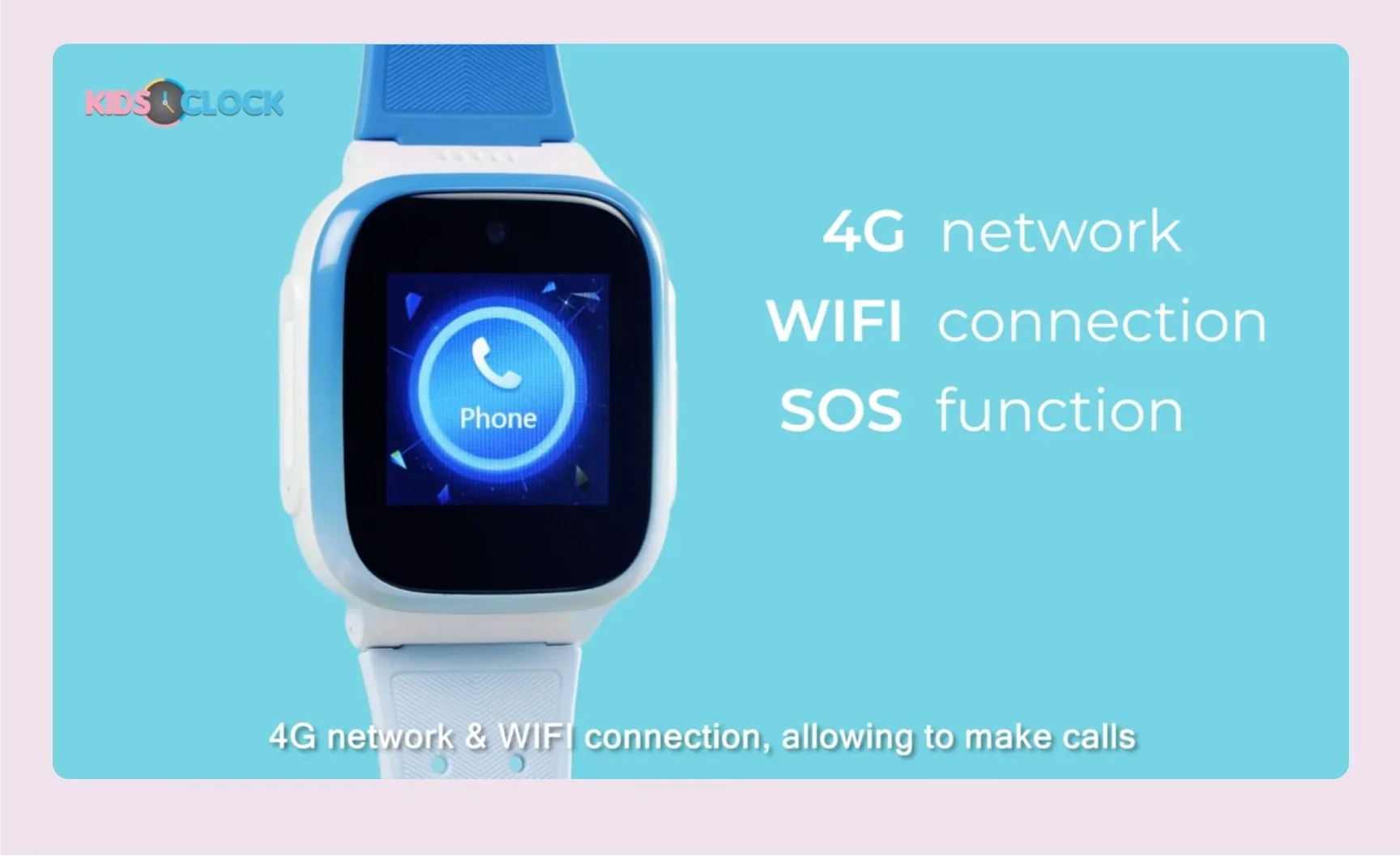
The homepage opens on every watch and colour in one line-up, then moves through safety, connection and play, each in its own brand colour, before the collection and the parent app.
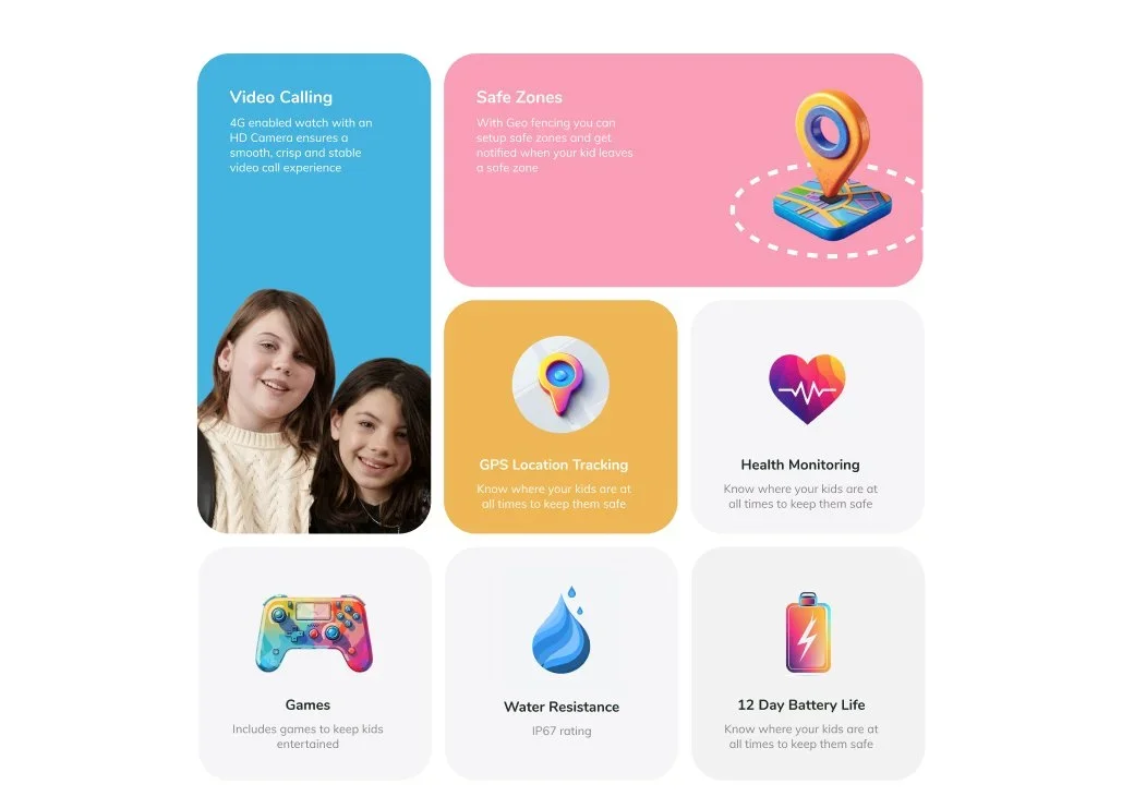
Video calling, safe zones, GPS tracking, health monitoring, games, water resistance and battery life sit in one bento grid, with the two features parents ask about most given the largest tiles.
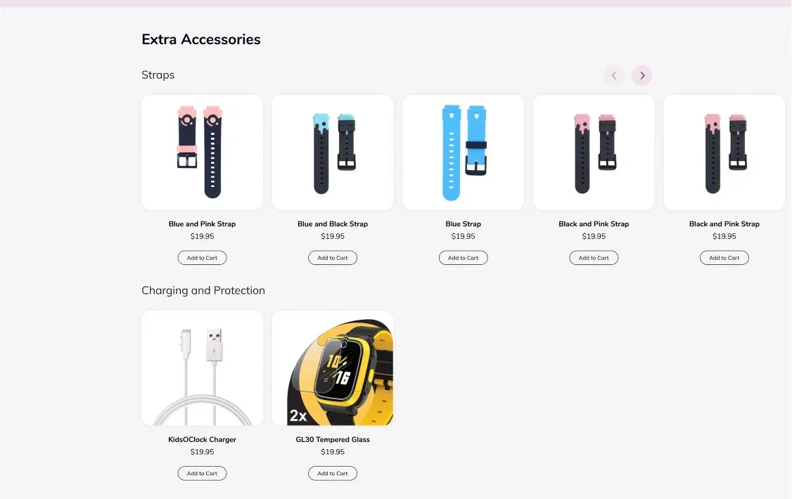
Price, colours and what is in the box come first, then accessories you can add without leaving the page, full specifications, feature stories, support links and FAQs.

A comparison page sets KidsOClock beside named rivals on price, thickness, app fees, data costs and safety features, then spells out what a family saves over one and two years.
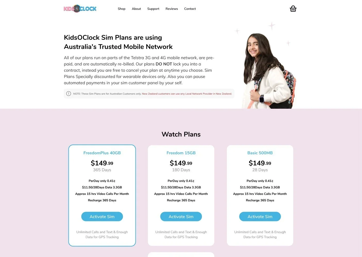
A watch is useless without a plan, so SIM plans got their own page with watch and phone plans, a customer panel for renewals and top-ups, and FAQs on cost and coverage.
Standard, hover, sale and sale with Afterpay instalments share one card, so promotions like the EOFY sale could go live without redesigning the shop.
Mobile
Most parents shop from their phones, so every page has its own mobile layout, with comparison tables and plan cards restacked rather than shrunk.

Shop

Product

Compare

SIM plans
More screens
The shop, model differences, accessories and an in-page product video, all in the same playful system of pink, sky blue, sunshine yellow and lilac.
Next project
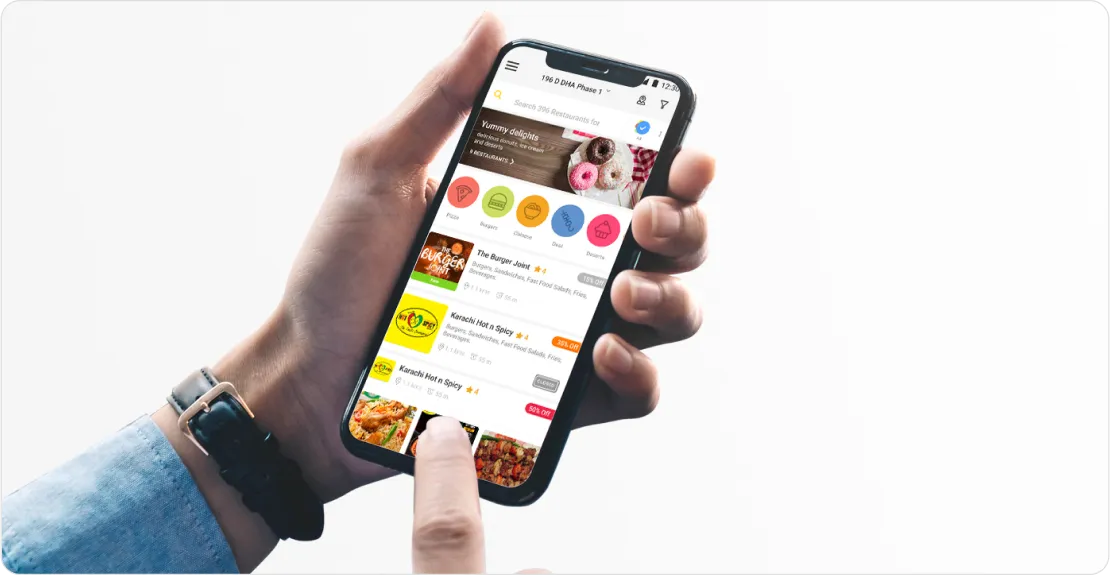
Kuks is a mobile platform that brings food discovery, reservations, and ordering into a single experience.