


Marketing and Lead Generation Platform.

Mailmunch, having launched their web platform in 2015 and in five years, they had grown to help over 50,000 businesses. In order to keep growing, they wanted to uplift their presence on the website so they are able to communicate their strengths to further masses.
We were given a deadline of 8 weeks to deliver a rebranded and redesigned website. In order to achieve the goal, we had to work smart and create resources and elements that would require minimum iterations to speed up the process. In short, we had to strive for perfection from day one.
We have consistently received fantastic praise for our website and it has been listed in the top 5 B2B SaaS sites multiple times. Our customers love the low-friction design. It's great to have a Product and Design sparring partner that can think deeply about our problems and come up with original solutions through a combination of user studies, fantastic UX expertise and empathy.
To ideate on the needs of the client, we conducted competitive and comparative analyses to understand Mailmunch’s market positioning. Our focus laid on user groups from e-Commerce organizations and startups. After analyzing several competing SaaS platforms, we studied Mailmunch’s analytics to observe the website’s trends; what’s working on the site and what’s not.
The insights we gathered in the discovery phase became the northstar on the direction to follow. We created wireframes and took into consideration their content strategy while creating a new look and feel to their information architecture.
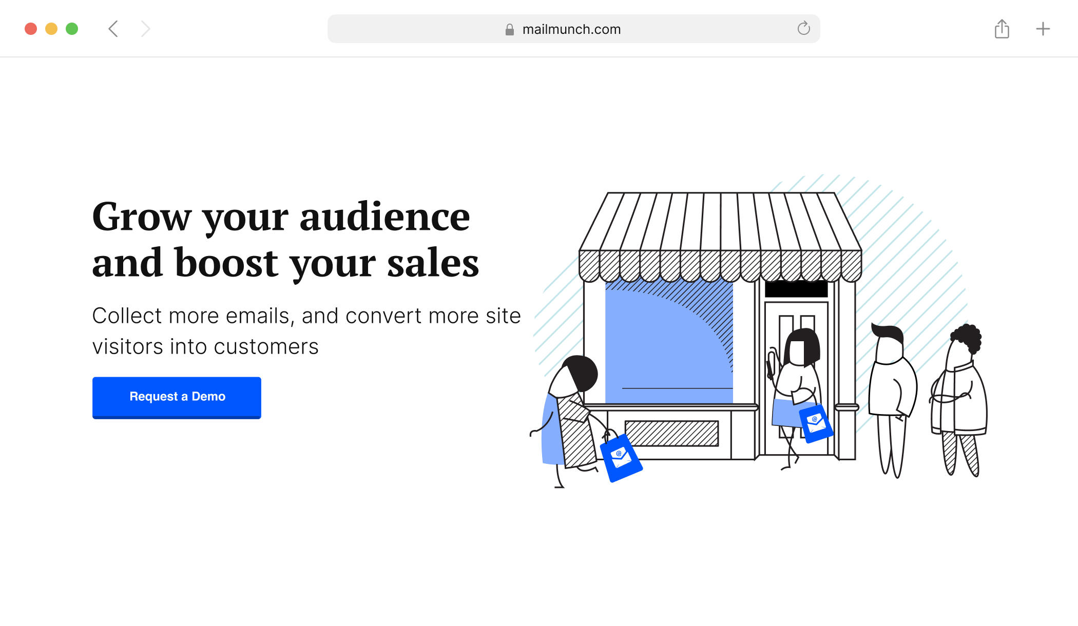
There was a need to create a seamless website where viewers could easily get a hold of the information they are looking for.
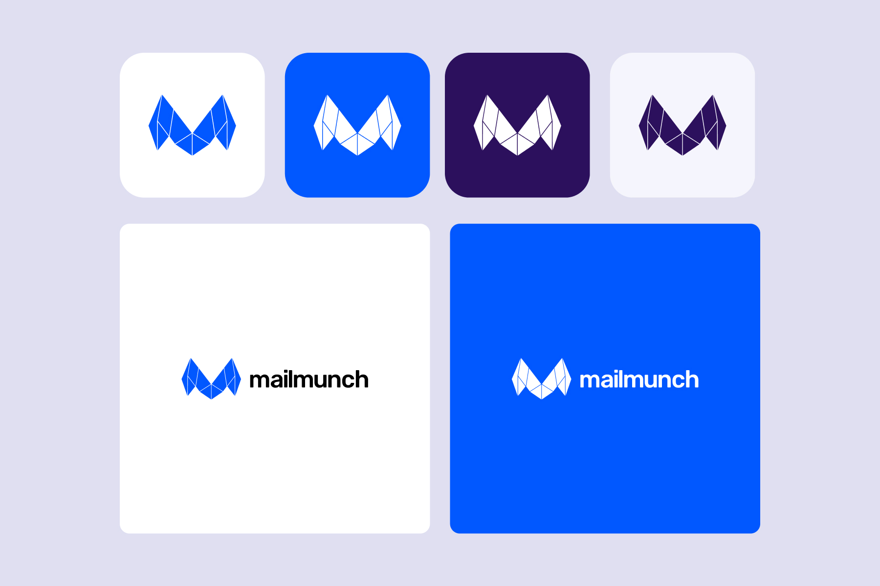
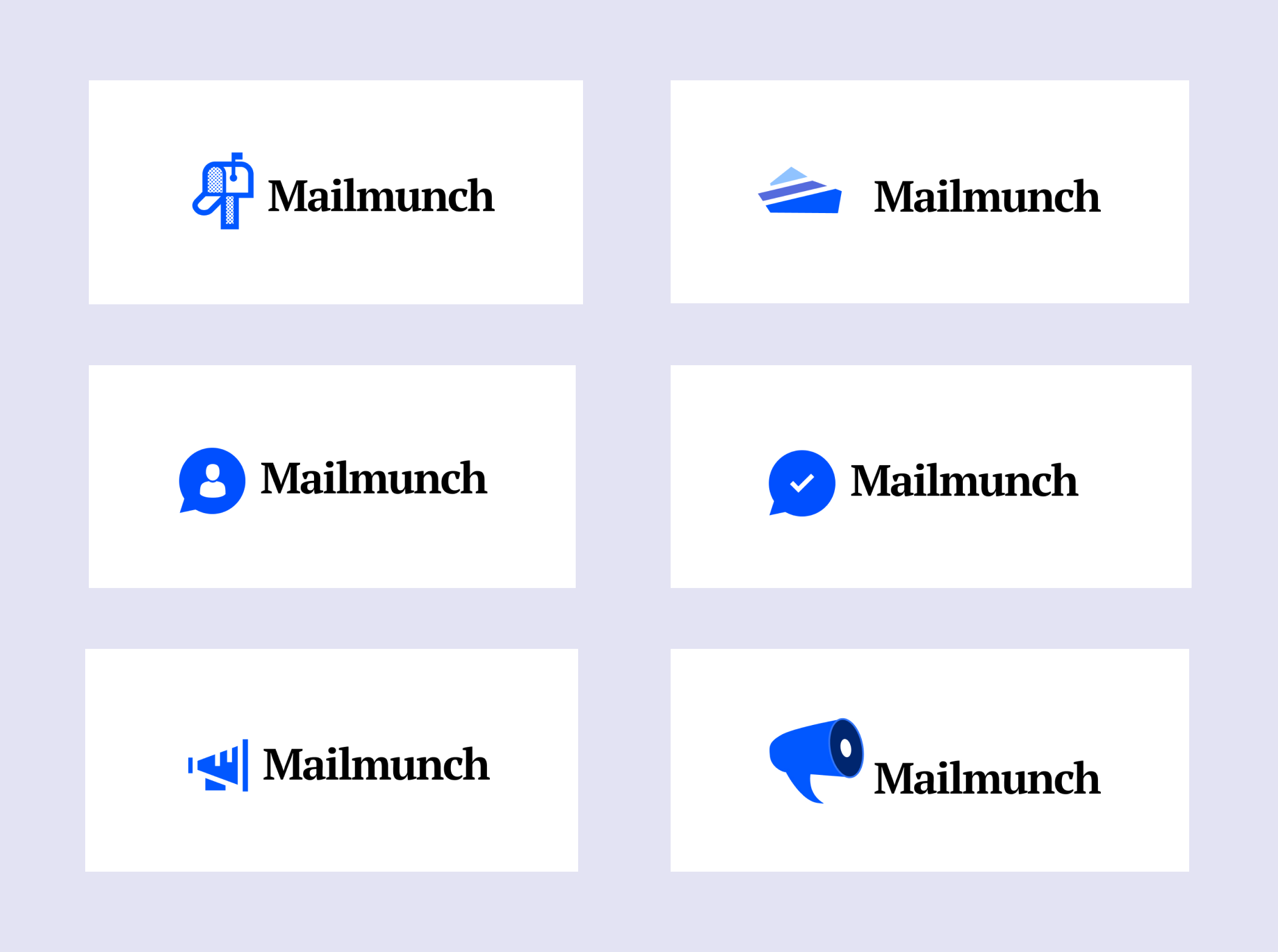
Our process was fairly simple. We started with redesigning the logo and establishing a design language that would be consistent throughout the site.
Giving the brand a do-over meant we had the opportunity to take this in a direction that we envision which could easily resonate with its target audience. Our goal was to create something modern and slee, that would look fresh and appeal to the general audience of users and a brand that would stand out amongst the many SaaS platforms that already exist.
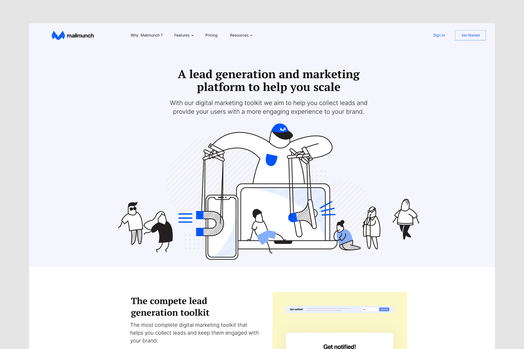
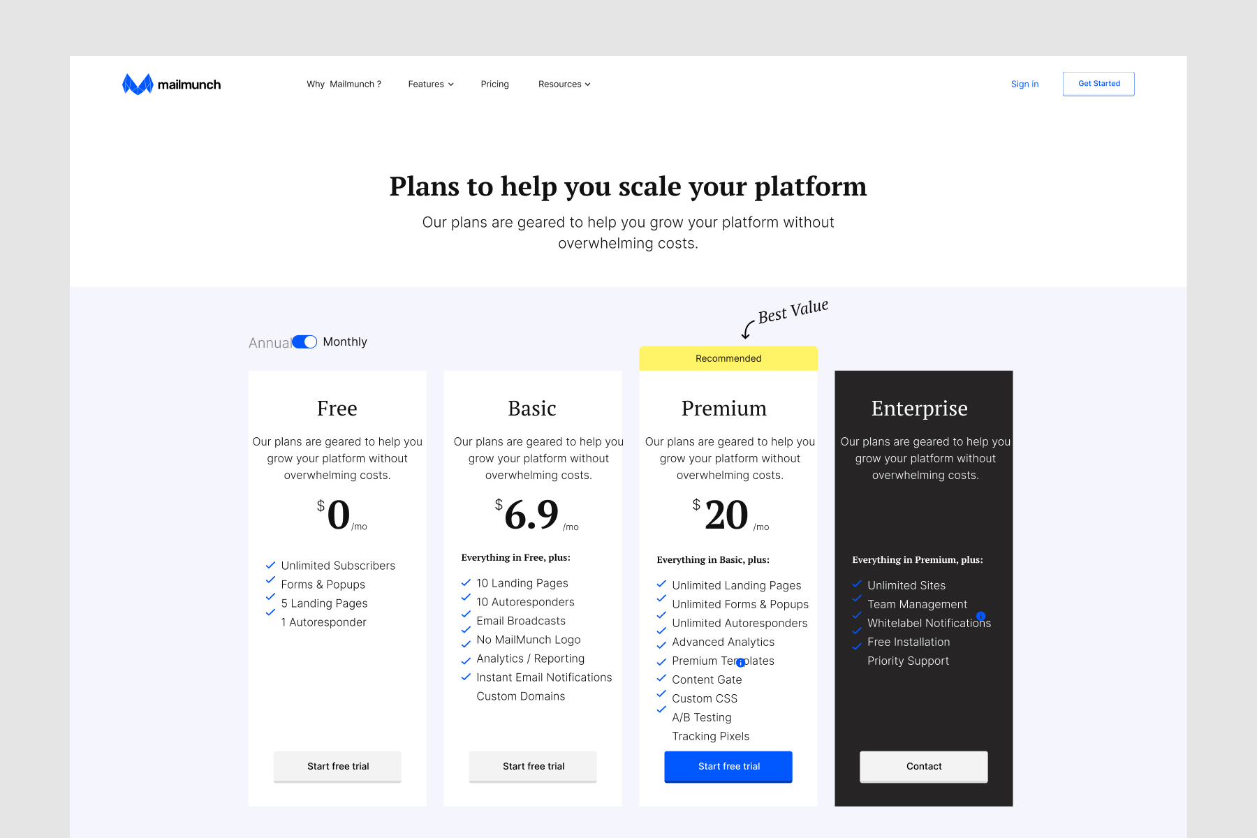
We created an architecture that would serve the purpose for setting up a SaaS website that focused around explaining their value offering and features leading to signing up new users.
Once the architecture was setup we created high-level layouts and wireframes were half baked to focus on the messaging strategy. With the user's in mind we focused on the users on what information was important for that to provide, creating an appropriate content for relavant pages with signup conversion in mind.
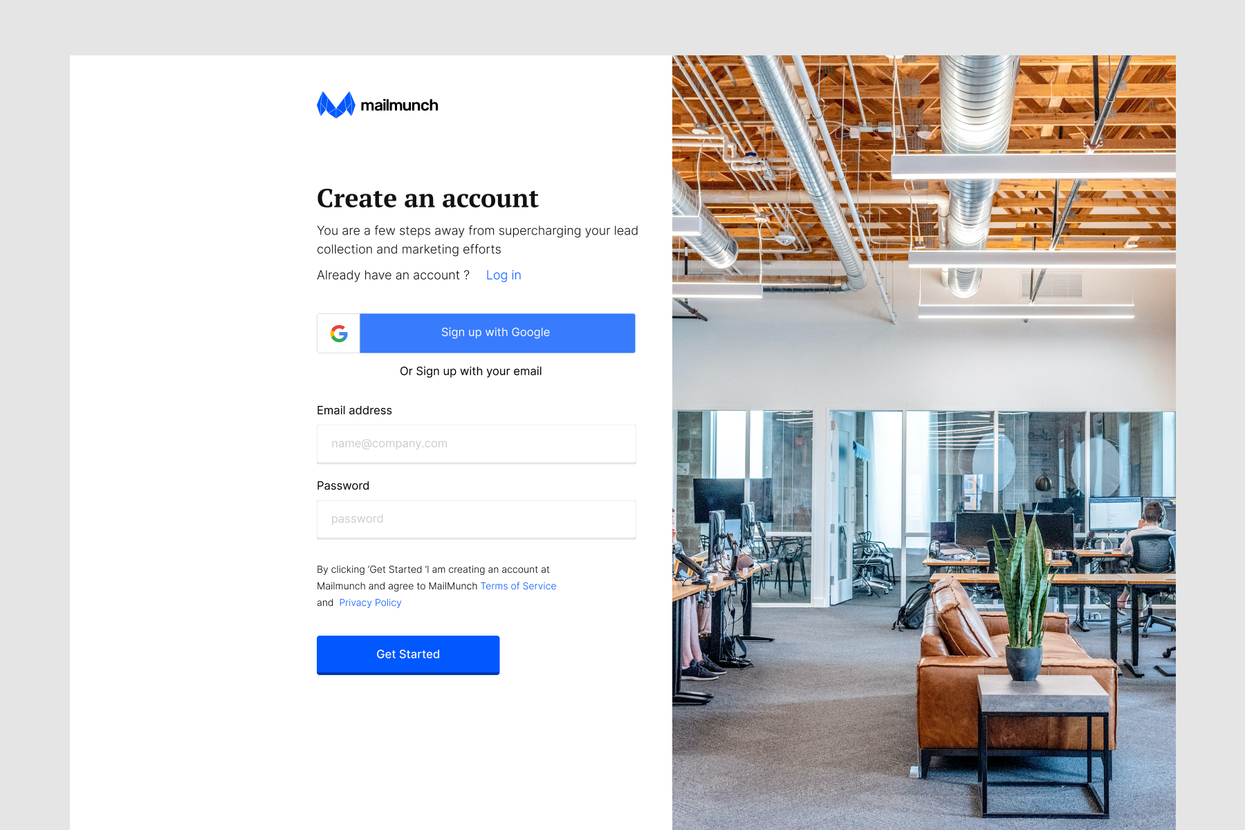
Wireframes were then matured into final design screens, and at the same time focusing on creating animation and visual content for different sections. All head sections for important pages were added with customization illustration and animation to bring the page alive.
We were able to improve several metrics with our redesign
A full-stack design and development agency building mobile apps, websites and e-Commerce platforms for startups and enterprises.
Made With

On Earth


