


Most founders rebuild their website three times before realising the problem was never visual. Here's how to know if your homepage has a messaging problem, and how to fix it.
Every six to nine months, a familiar conversation happens inside a funded SaaS team.
The numbers aren't where they should be. Conversion is flat. Demos feel like uphill work. Someone in the room says the line that kicks off the next quarter of activity:
"We need to redesign the website."
So the team hires a design agency, picks a new color palette, swaps out the hero illustration, tightens up the typography, and ships a polished new homepage. Three months later, the numbers haven't moved. Sometimes they get worse.
This pattern is so common it's almost a tradition. And it's almost always solving the wrong problem.
If your SaaS homepage isn't converting, the problem is rarely how it looks. The problem is that a stranger can't tell what it does, who it's for, or why they should care.
That's not a design issue. That's a message issue. And no amount of redesign will fix it, because design can only amplify a clear message. It cannot create one.
Here's how to tell if your homepage has a messaging problem (most do), and what to do about it.
The 7-second test, and why most SaaS sites fail it
There's a useful test we run on almost every homepage we audit. Pull up the page in an incognito window, look at it for seven seconds, then close the tab. From memory, answer three questions:
- What does this product do?
- Who is it for?
- Why should I care, right now?
If you can't answer all three, your visitors can't either. And your visitors are giving you a lot less than seven seconds.
The reason most SaaS sites fail this test isn't that the founders aren't smart. It's that they're too close to the product. After two years of building, every internal phrase feels self-explanatory. "AI-powered revenue intelligence platform" sounds crystal clear inside the building. To a stranger, it's three buzzwords stacked on top of each other.
The two failure modes
Almost every underperforming SaaS homepage falls into one of two camps:
The first is the abstract homepage. It uses category language ("workflow automation," "collaboration platform," "data intelligence suite") instead of describing what the product actually does. A visitor reads it and thinks, "I think I know what this is, but I'm not sure what it does for me."
The second is the feature-list homepage. It tells the visitor everything the product can do, in order of what the team is most proud of, with no clear hierarchy. A visitor reads it and thinks, "There's a lot here, but I don't know where to start, and I don't know if any of it solves my actual problem."
Both fail for the same reason: they're written from the inside out. They lead with what the product is, instead of what changes for the user.
The shift: from founder-led copy to user-led copy
The single highest-leverage change you can make to a SaaS homepage is to flip the perspective. Stop describing the product. Start describing the user's outcome.
This sounds obvious. It's also the thing almost no SaaS site actually does. Here's what the difference looks like in practice:
Look at the right column. Notice what's happening:
- It names a specific outcome (closing deals, shipping code, ending a frustration).
- It implies a specific user (a sales leader, an engineer, an ops person, a manager).
- It uses language the user already says out loud, not language the marketing team invented.
This is the core of the StoryBrand approach, and it's why we use the SB7 framework with most of our clients. The user is the hero of the story. The product is the guide. Founder-led copy treats the product as the hero. User-led copy treats the user as the hero. The second one converts.
The hero section: five elements that have to do real work
Your hero section (the part of the homepage above the fold) carries roughly 80% of the conversion load on the entire site. Most visitors will judge whether to stay or leave based on what they see in those first few hundred pixels.
Here's what each element of the hero needs to answer, from the user's perspective:
Run your current hero through this table. If any row is unclear, vague, or borrowed from a competitor, that's the row costing you conversions.
Three patterns that quietly kill SaaS homepage conversion
Pattern 1: The category headline
"The modern platform for X." "The all-in-one tool for Y." "The future of Z."
These headlines describe a category, not a product. They're interchangeable across thousands of SaaS sites. A visitor learns nothing from them, because every competitor in your space is saying some version of the same thing.
The fix: replace the category claim with a specific outcome. Not "the modern revenue platform," but "see which deals will actually close this quarter." Specificity is the cure for sameness.
Pattern 2: The feature flood
Six tiles. Each one with an icon and a feature name. Real-time analytics. Custom workflows. Smart integrations. AI assistant. Role-based access. Audit logs.
This format feels comprehensive, but it forces the user to do the assembly. They have to mentally combine six features into one understanding of "what this product does for me." Most won't bother.
The fix: lead with the outcome, then show two or three features that prove it's possible. Features support the story. They don't replace it.
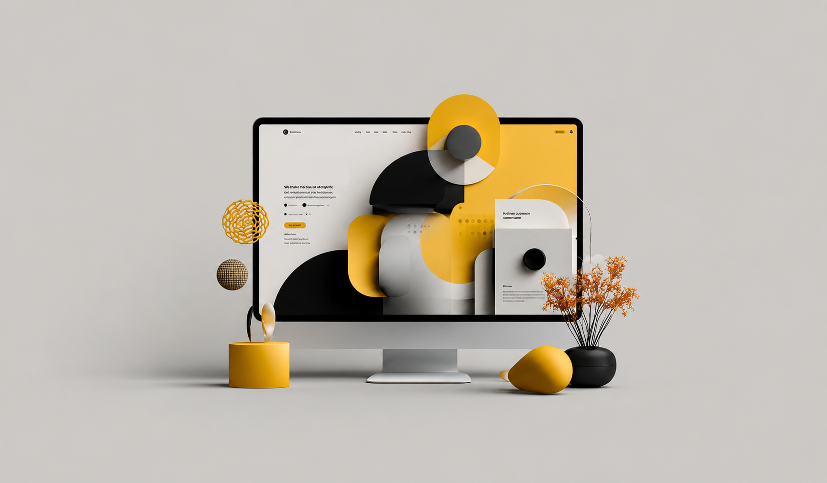
Pattern 3: The mystery product visual
A stylised illustration. An abstract gradient. A floating UI fragment with no context. Something that looks beautiful in a portfolio but tells a visitor nothing about what they'd actually use.
The fix: show a real product screen, with real-looking data, and label what the user is looking at. People trust what they can see themselves using.
How to rewrite your hero in one afternoon
Before you call a design agency or commission a redesign, try this exercise. It costs nothing and takes about three hours.
- Pull up your last 10 closed-won customers. Look at the actual words they used in sales calls, support tickets, or testimonials when they described what your product changed for them. Write down the phrases that appear more than once.
- From that list, pick the single outcome that comes up most often. That's your headline candidate. Phrase it as a clear, specific result the user gets.
- Identify the one user role most likely to feel that outcome the strongest. That's your sub-headline. Name the role and the situation.
- Replace any abstract product visual with a real screenshot of the moment that outcome happens. Annotate it if you have to.
- Rewrite the CTA so it describes what happens next, not what the user has to do. "See your first report" beats "Sign up."
- Read it out loud. If it sounds like something you'd actually say to a friend, you're close. If it sounds like a press release, start over.
Most teams find that this exercise alone produces a hero that outperforms the previous one without changing a single design element.
When the message is right, the design becomes obvious
Here's the part founders often miss. Once your message is clear, the design problems mostly solve themselves. You suddenly know which screenshot to use, because you know which outcome to show. You know how to lay out the page, because you know which story you're telling. You know what to cut, because everything that doesn't support the message becomes obviously redundant.
This is why redesigns without a messaging foundation almost always fail. They're polishing a structure that was never load-bearing.
Design is a multiplier. Multiply by zero and you still get zero. Get the message right first, then design will do its job.
The bottom line
If your SaaS homepage isn't converting, before you redesign it, audit it. Run the 7-second test on someone who has never seen your product. Ask them to repeat back what it does, who it's for, and why they should care.
If they can't, the problem isn't your designer. The problem isn't your developer. The problem isn't the color of your CTA button.
The problem is that your homepage is talking about your product instead of talking to your user.
Fix that, and your conversion rate will move before you've changed a single pixel.
WORK WITH VENTURE REPUBLIC
Want us to audit your homepage?
We help funded SaaS teams sharpen their homepage messaging using the SB7 framework, then redesign around the new story. We'll tell you exactly which lines are working, which are costing you conversions, and what to change first.
Get a free homepage teardown. venturerepublic.net/start-a-project

.jpg)


