


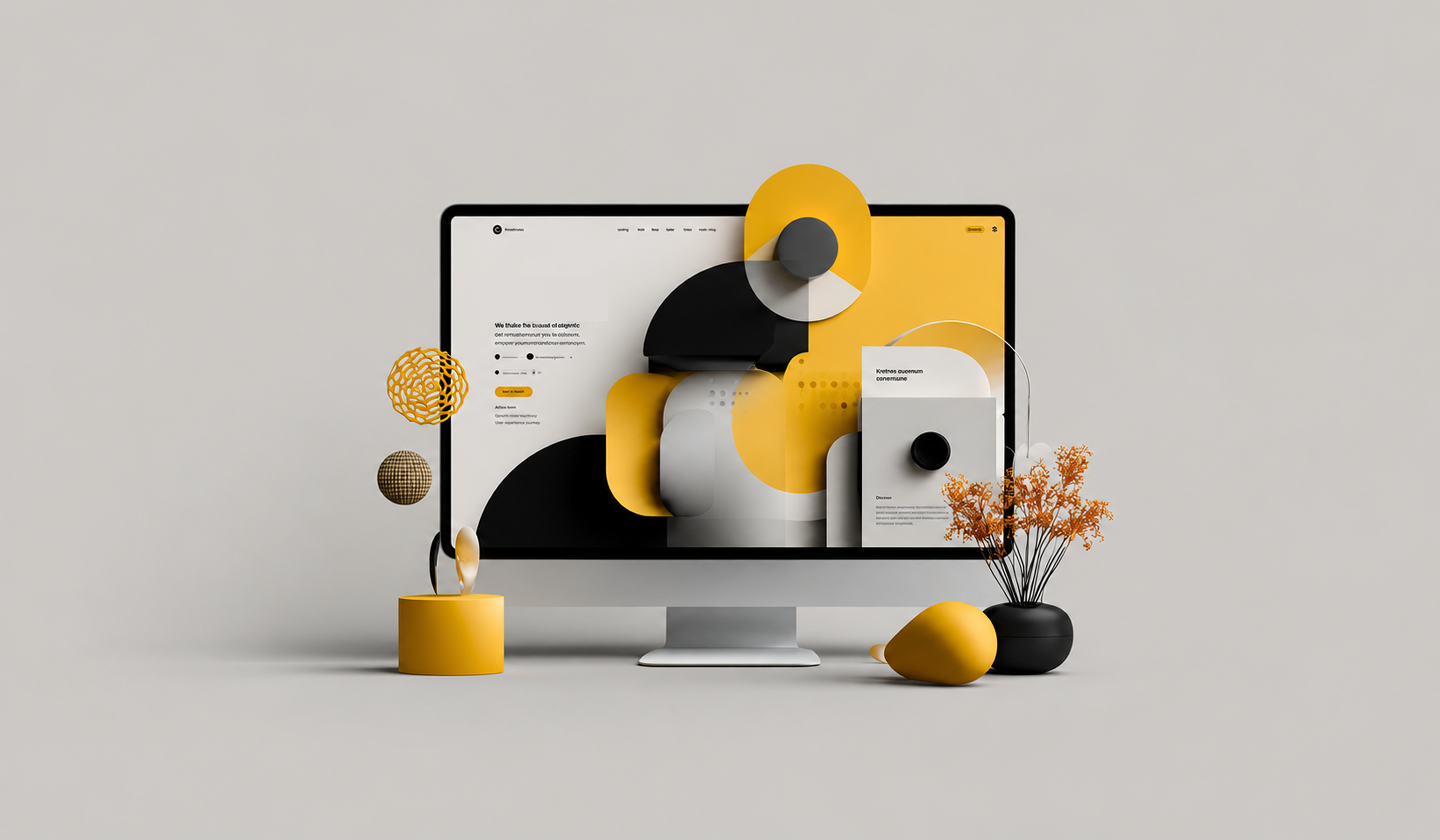
In today's digital age, design is a highly sought-after skill. More and more businesses have started to understand the need and importance of great design and the customer's experience in order to make their digital products a success. Successful design specialists are usually individuals with a keen eye for attention to detail and they are able to differentiate what works on an interface from what doesn't. The multitude of tools helps designers fix design issues promptly while adding to the quality of work they produce.It is a misled interpretation that design can be random. It depends upon the designer's creativity and capability for sure but it does follow some principles as well. Let's discuss the 8 fundamental design principles in detail:
1. Alignment

Alignment is one of the most important principles of design as it helps in creating a crisp, sharp and orderly arrangement for designs by ensuring the various elements mix well with each other. This is not limited to the center, right or left alignment but to the alignment between an object and text as well. This is the first thing designers check if something doesn't look right to them in their designs.
Grids also work as a framework to arrange UI elements in a way that consistency and a visual balance is maintained throughout the designs. They act as a guide to the UI designers and developers to ensure the elements are well-placed. One great tool that we swear by is the grid calculator.
Grid Calculator: http://gridcalculator.dk/
2. Contrast

Contrast majorly helps designers specify emphasis on certain elements. A "pop" is quite often asked of from clients. While that sounds like a completely generic demand, it is most often related to contrast that they find missing in the designs. Contrast is all about how one element sacrifices its magnificence for the sake of another element to become the show stopper.
Contrast also works as a great tool to increase the accessibility of any design since it increases the usability of a design to users with any visual impairment or situational disabilities. In order to suffice these, contrast needs to be adjusted according to the need and use of a specific design.
3. Repetition

It is a known fact that repetition is a great way to reinforce an idea or concept. Repetition in design can be done in a number of ways; including color usage, typefaces, shapes or any specific visual representation elements. This does not only help designs resonate with any specific branding if required but also helps to hold a place for itself in the user's cognizance.
For example, on our website, each blog has the same formatting where headings are kept in a specific font size and the rest of the text in another and the relevant images for each heading are placed at the beginning of it. Through this repetition and consistency, it is easier to capture a chunk of the reader's affiliation with the brand.
4. Hierarchy

Hierarchy refers to the importance of elements in a design. What element is it to be highlighted? It is all about prioritizing all elements in a way that the ones with the most important come to the user's or viewer's attention at once. A design is not just a visual. It is the visual translation of a message that a brand, individual or designer is trying to convey to the audience and the purpose of converting a message to a visual form is that it should speak louder than a simple message in text form.
5. Proportion

Proportion is a simpler concept than the other seven. It signifies the size of elements in proportion to others. The larger an element, the more important it is. The smaller the element, the less attention it requires.
Proportion helps give stability and symmetry to a design. It gives a clear message and decides the flow of information in the minds of the users. It might be a simple principle but plays a major role in deciding the fate of your creative effort.
6. Color

Color plays a major role in deciding the mood and tone of your design. Each color has a significant message that it conveys. Colors are also responsible for attracting the user and making them stick to search for a message in the design. An uncoordinated color palette is likely to make the users skip your visual and move on to the next digital message.
Do make sure that the color combinations you opt for do not create any hindrance in the legibility and clarity of the text or overpower any element. Coolors is a great online tool to help designers come up with color schemes and add life to their designs.
7. Space

It is a common misconception that white spaces do not mean anything in design and there is no significance of these. Truth is, the spaces you leave empty are as important as the spaces you fill out with elements in a design. Negative space creates a shape and holds fort of your overall design by giving it a visual appeal that is required for a user to comprehend the message they are coming across. Too much clutter confuses a viewer and takes their attention away from the real message.
8. Proximity

Creating a flow in your designs and organizing the visuals is extremely important. This can mean grouping consistent shapes together or connect the elements in a way that makes them come together to reinforce a message with all might. However, this doesn't mean that the elements need to be clustered together for placement.
In order to start building great visual contact, one needs to learn the art through these basic principles. It is like they guide a designer to naturally produce the best kind of work. These principles are going to help you build highly effective designs that speak for themselves. It is of incredible value how these functions impact designs and implementing these is vital to the success of any design project. It is quite possible for a designer to follow their intuition and come up with good designs that stand out but it might take a lot of effort or years of experience. So, in order for aspiring design specialists to create something with a premium user experience, learning about these is ratified.
.jpg)


